
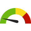
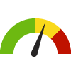
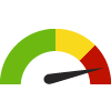
Indicator Gauge Icon Legend
Legend Colors
Red is bad, green is good, blue is not statistically different/neutral.
Compared to Distribution
 the value is in the best half of communities.
 the value is in the 2nd worst quarter of communities.
 the value is in the worst quarter of communities.
Compared to Target
 meets target;
  does not meet target.
Compared to a Single Value
 lower than the comparison value;
 higher than the comparison value;
 not statistically different from comparison value.
Trend

 non-significant change over time;
 significant change over time;
  no change over time.
Compared to Prior Value
 higher than the previous measurement period;
 lower than the previous measurement period;
 no statistically different change from previous measurement period.
 Significantly better than the overall value
 Significantly worse than the overall value
 No significant difference with the overall value
 No data on significance available
COVID-19 Daily Average Case-Fatality Rate
Select a County
Measurement Period: Mar 3, 2023
This indicator is archived and is no longer being updated. Click to learn more
This indicator shows the daily average confirmed deaths due to COVID-19 calculated from the daily average confirmed cases recorded in the preceding 7 days (for example, Jan 31 includes the daily average deaths between January 25 - January 31, 2020).
Numerator = daily average confirmed deaths in preceding 7 days
Denominator = daily average confirmed cases in preceding 7 days
Why is this important?
Case-fatality rate is the proportion of persons with a particular condition (cases) who die from that condition. It is a measure of the severity of the condition. The case-fatality rate is a proportion, not a true rate. As a result, some epidemiologists prefer the term case-fatality ratio. Case-fatality rate still is seen as the best tool to express the fatality of this disease; however, it may be an underestimate when widespread testing is not available. By showing the daily average case-fatality rate per week, this approach helps prevent major events (such as a change in reporting methods) from skewing the data and better allows visualizations overtime.

deaths per 100 cases
| County | Source | Measurement Period | Deaths per 100 cases | |
|---|---|---|---|---|
Data Source
- Healthy Communities Institute
Maintained By: Conduent Healthy Communities Institute (Methodology)
Filed under: Health / Immunizations & Infectious Diseases, Health / Respiratory Diseases, Health Outcomes, Adults, Older Adults