


Welcome to your one-stop source for Hawai'i health data. We provide essential information for researchers, planners, policy makers, community members and students. Click here for more information on how to use this website.
FOCUS ON
Learn more
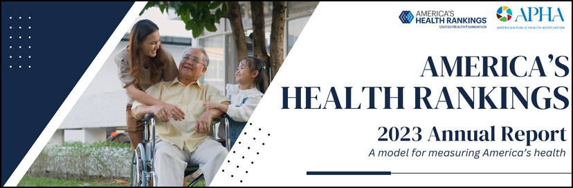
America's Health Rankings 2023 Annual Report
Americaʻs Health Rankings, in collaboration with the American Public Health Association, has released a comprehensive annual report of health and well-being of the nation based on 87 measures of health, grouped into 5 categories from 28 data sources.


Site Features
Monitors Hawai‘i's progress towards achieving national health objectives. Now expanded.
Build your own custom data report or community report and explore health topics.
Access tutorials and request help or training.
The SocioNeeds Index® Suite is a robust toolset embedded with the HCI platform that integrates powerful analytics to help identify and reach under-resourced communities.
Compare select indicators by county and state level.
Browse the repository of state and local reports categorized by topic areas.
View population data by race, gender, ethnicity, and more.